intervenção arquitetônica permanente fachada e arredores do edifício da Escola René Binet Paris, França
permanent architectural intervention façade and environs of the École René Binet building Paris, France
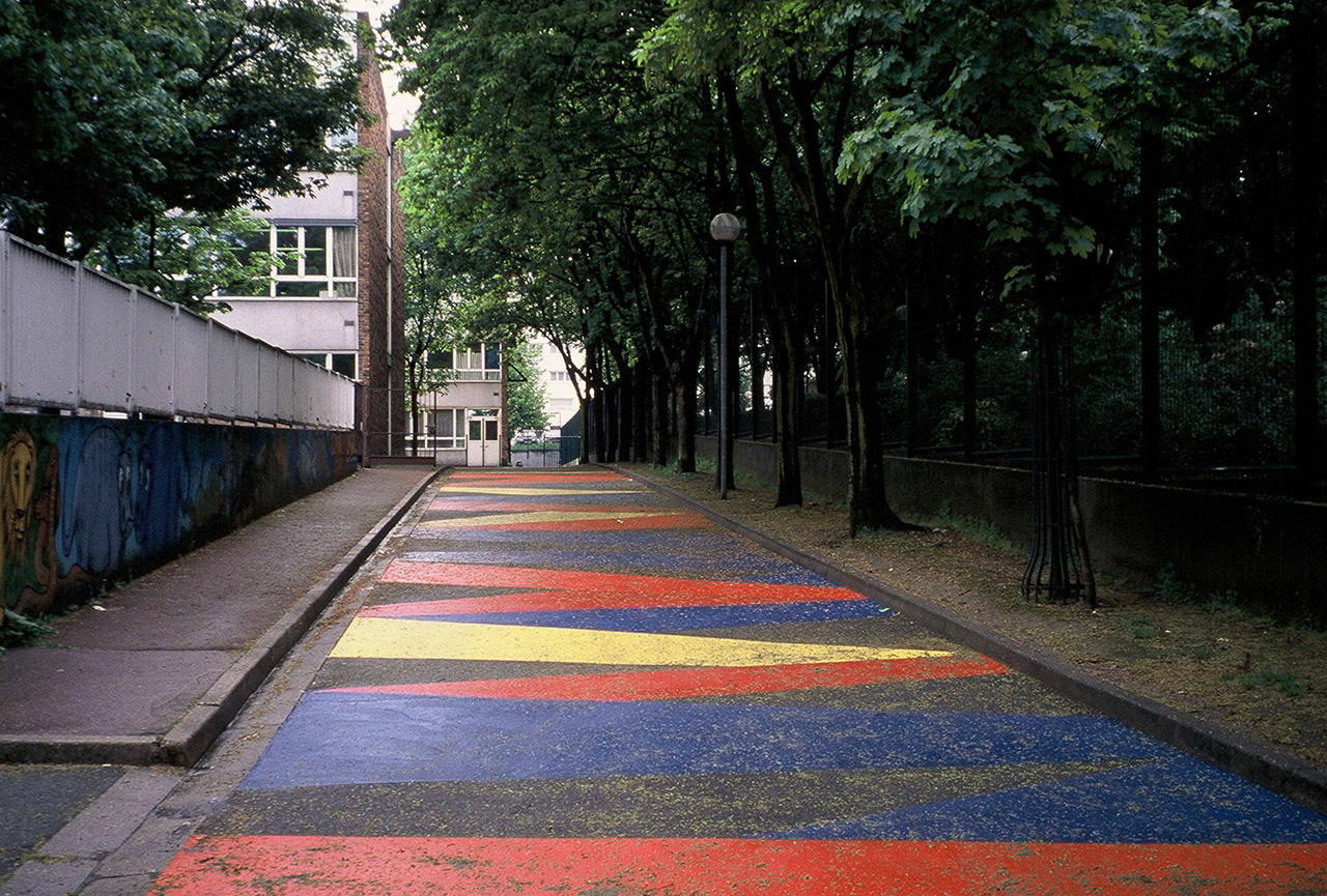
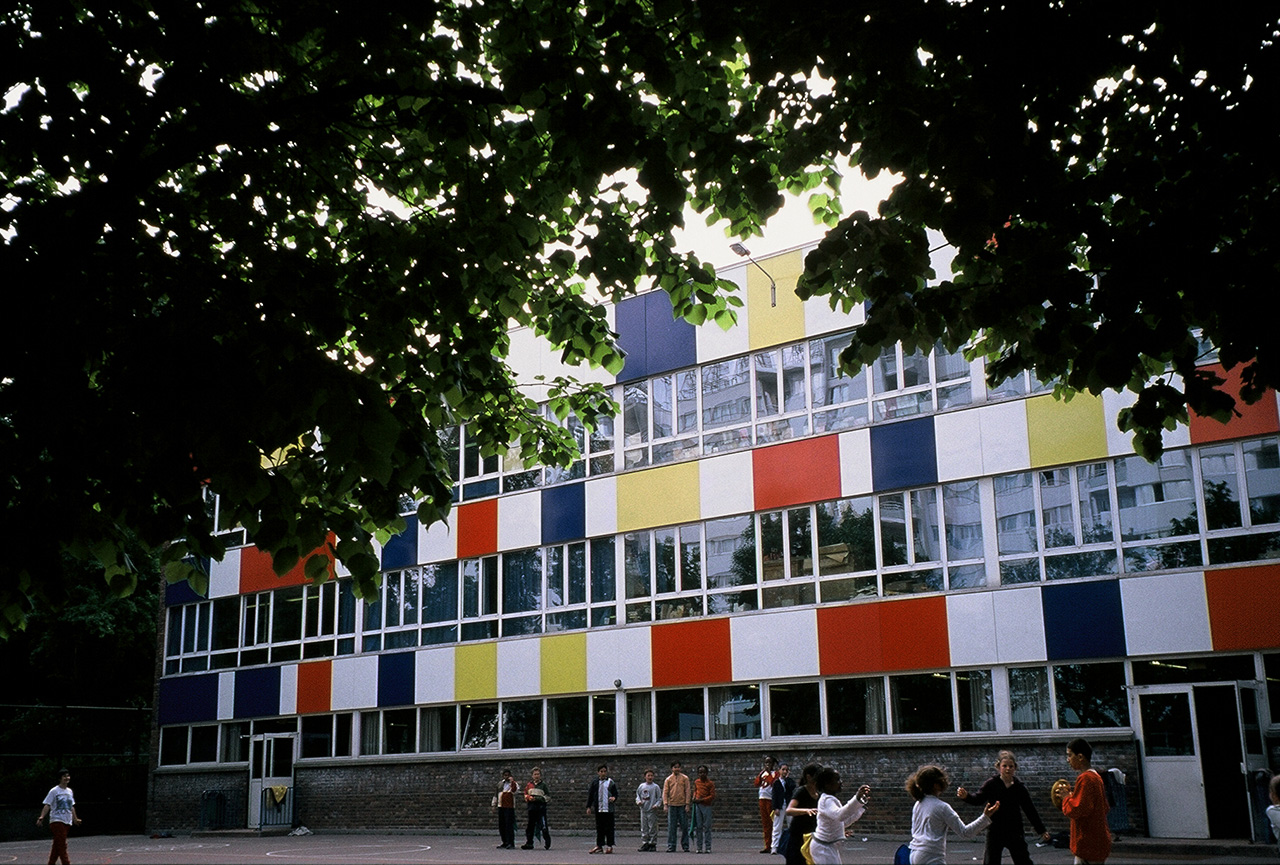
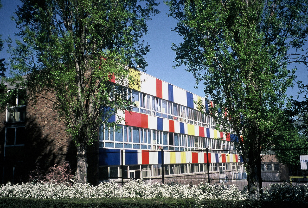
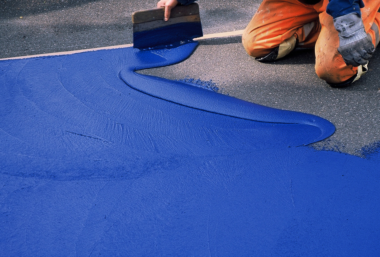
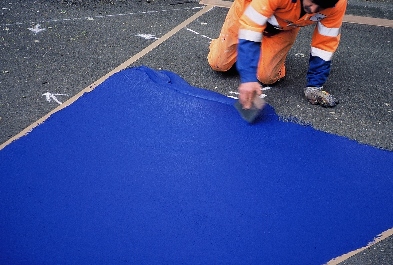
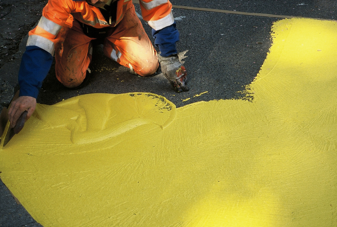
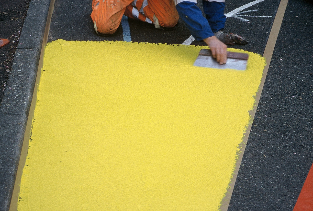
O desenho do piso Os esboços e desenhos propostos para os caminhos em torno da escola eram constituídos por faixas coloridas, estreitas ou largas, tecidas no ritmo do andar. As cores eram fortes e contrastantes, de modo a serem nítidas e distintas: azul, amarelo, vermelho-escuro e vermelho-claro. A nova fachada Para a fachada, propus uma intervenção referida a elementos histórico-culturais de tradição visual francesa. Adotei como referência os vitrais das catedrais góticas, marcos históricos de edificações urbanas e coletivas. Assim, recorri à repetição de módulos em três tamanhos diferentes, com variações rítmicas a partir de quatro cores, tal como no chão: amarelo-claro, vermelho-claro, vermelho-escuro e azul intenso. A inserção dos módulos metálicos coloridos deu-se nas faixas opacas longitudinais do edifício. A opção por cores intensas, vivificadas pela superfície brilhante dos módulos metálicos, atendia também ao propósito de destacar e sublinhar o edifício da escola num entorno marcado por gigantescos luminosos publicitários. A unidade do projeto – pavimento e fachada A escolha do mesmo conjunto de cores para a fachada e o pavimento buscava enfatizar a unidade do projeto, combinando o plano horizontal do caminhar, ativo e vivencial, e o plano vertical, visível a distância, fazendo da escola um signo coletivo, um marco de referência para os habitantes do bairro.
* Trechos do memorial descritivo, integrante do projeto apresentado à prefeitura de Paris em janeiro de 2004. Os tempos verbais foram, aqui, convertidos em formas pretéritas, pois, no inverno de 2015, o trabalho foi demolido junto com partes do edifício para uma remodelação ampla de todo o conjunto escolar. [CG]
The drawing on the floor The proposed sketches and drawings for the paths around the school consisted of colored bands, narrow or broad, woven in the rhythm of the floor. The colors were strong and contrasting, so they were sharp and distinct: blue, yellow, dark red and light red. The new façade For the façade, I proposed an intervention referring to historical-cultural elements of French visual tradition. I took as a reference the stained-glass windows of the Gothic cathedrals, historical landmarks of urban and collective buildings. Thus, I used repetition of modules in three different sizes, with rhythmic variations based on four colors, as on the floor: light yellow, light red, deep red and deep blue. The insertion of the colored metal modules was done in the opaque longitudinal bands of the building. The option of intense colors, vivified by the shiny surface of the metal modules, also served to highlight and emphasize the school building in an environment marked by gigantic advertising billboards. The unit of the project – floor and façade The choice of the same set of colors for the façade and pavement sought to emphasize the unity of the project, combining the horizontal plane of walking, active and experiential, and the vertical plane, visible at a distance, making the school a collective sign, a reference point for the neighborhood’s inhabitants.
* Excerpts from the descriptive memorial, part of the project presented to the city government of Paris in January 2004. The verb tenses were here converted into the past tense because in the winter of 2015, the work was demolished, along with parts of the building, for a broad remodeling of the whole school grounds. [CG]


Você precisa fazer login para comentar.